Button
SwiftUIのボタンはUIKitを使っていた物からするとCustomViewでButtonを作っているような感じがしました。
基本系は以下でactionでタップされた時の処理を記述し次のクロージャでボタンのレイアウトを作成します。ボタンの色や画像を設定した時はUIKitのボタンと同じく青くなります。
Button(action: {
    print("Tapped")
}) {
    Text("Button")
           .background(Color.orange)
}
タップ領域の変更
タップ領域を広げる場合はレイアウトの方のframeを変更します。
Button全体に対してframeをつけても同じようなレイアウトにはなりますが、タップ領域は拡大されないので注意です。
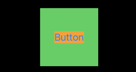
Button(action: {
    print("Tapped")
}) {
    VStack {
        Text("Button")
            .background(Color.orange)
    }.frame(width: 100, height: 100, alignment: .center)
    .background(Color.green)
}
ボタンの枠線
ボタンの枠線を以下のようにつけた場合角が見切れてしまいます。
角丸でなければこれでいいんですが角丸にした場合は別のアプローチをとる必要があります。
Button(action: {
    print("Tapped")
}) {
    VStack {
        Text("Button")
            .background(Color.orange)
    }.frame(width: 100, height: 100, alignment: .center)
    .background(Color.green)
}.border(Color.red)
.cornerRadius(10)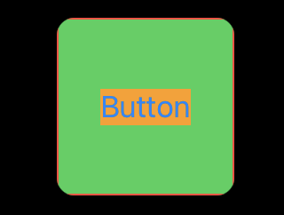
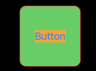
角を切れないようにするには.overrayとRoundedRectangleというViewを組み合わせる必要があります。
Button(action: {
    print("Tapped")
}) {
    VStack {
        Text("Button")
            .background(Color.orange)
    }.frame(width: 100, height: 100, alignment: .center)
}.background(Color.green)
.cornerRadius(10)
.overlay(
    RoundedRectangle(cornerRadius: 10)
        .stroke(Color.red)
)